Project Overview
About
Happy Bites is a boutique bakery started by two sisters, popularly known for their exquisite variety of delicacies. Since opening 2012, Happy Bites has quickly grown from being home-based to an award-winning bake shop.
Note: brand name has been changed in compliance with NDA.
Brief & Duration
Redesign the mobile version of their website to offer a simple, quick, and streamlined way for users to browse and place dessert orders on their site. Additionally, provide recommendations on how the UI could be improved.
Duration: 12 weeks.
My role
My role was to help design the necessary pages and map the browsing, order placement and delivery tracking process for the brand. I was client facing and led the design studio in conducting user research, identifying key problems, brainstorming and testing our solutions. I then created mid to high-fidelity wireframes and handed them over to their UI designer and developer to bring the final product to life.
Tools & Method
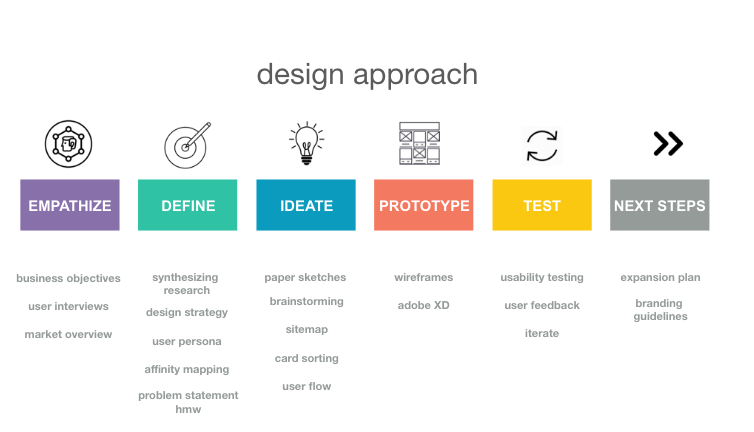
Client research, in-person qualitative user interviews, competitor analysis, synthesizing data, design strategy, user personas, feature prioritization, card sorting, sitemap, user flows, wireframes, mid-fidelity prototype, guerrilla usability testing, contextual inquiry, brand style guide.
Tools: In person interviews, Paper sketches, Adobe XD
Stage 1 – Empathize
Client research
We met with the founder to understand the vision of the company and learn more about their customers. Our conversations revolved around expansion goals of the company, business objectives, the target market and their needs.
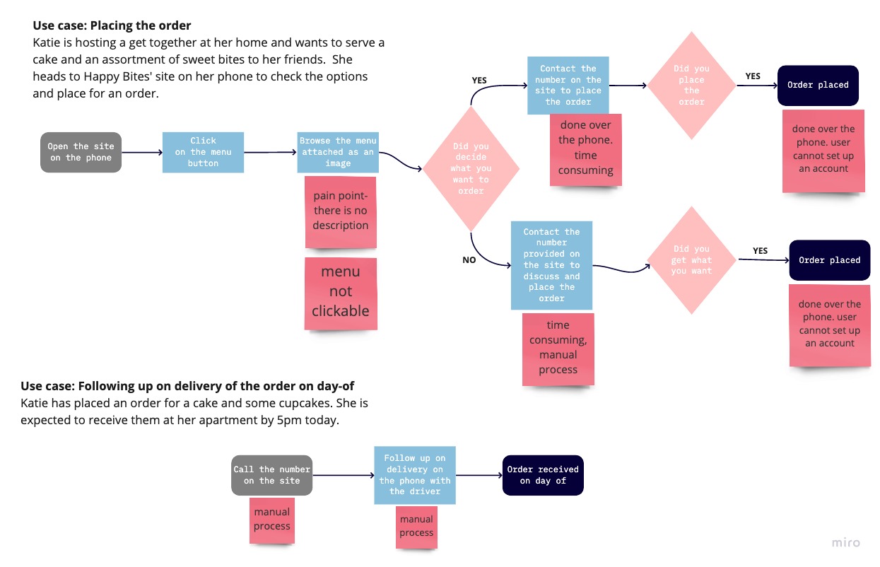
Users have been complaining the website is static and the menu uploaded is an image format and they are unable to browse the menu and place orders online. They have to do it over the phone.
Competitor Analysis
The client wasn’t comfortable with us sharing names of their competitors as it’s a close-knit community amongst them. However, they listed four bakeshops with similar services. We conducted a competitor analysis of their features, functions and usability of the site and identified their key strengths and weakness.
Strengths
- Each of them had a mobile version of their site where users could browse and place orders easily on their phones.
- Most of them also let you create an account.
Areas of improvement
- There were many items which weren’t categorized properly
- Too many pages on sitemap with information all over and not required for the mobile version. The sites could be more responsive.
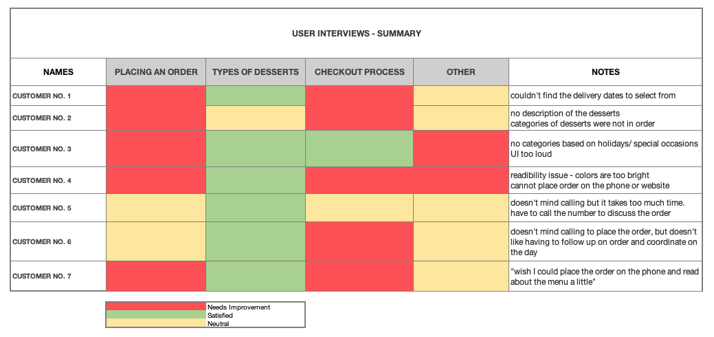
User Interviews
Their customer base is predominantly women, aged between 28-35 and that’s whom they wanted us to focus on. We interviewed seven users who were loyal customers, and their details were provided by the client.
Interview questions
- What do you love about Happy Bites?
- What do you use Happy Bites for?
- How often do you order from there?
- What type of desserts do you like? What are your favorites from Happy Bites?
- What problems are you facing with the site?
- Are there any other frustrations that you experience?
Stage 2 – Define
Synthesizing research
We made a summary of the interviews, after which I involved the sisters and we got together. shared our notes, brainstormed and did affinity and empathy mapping of our findings.
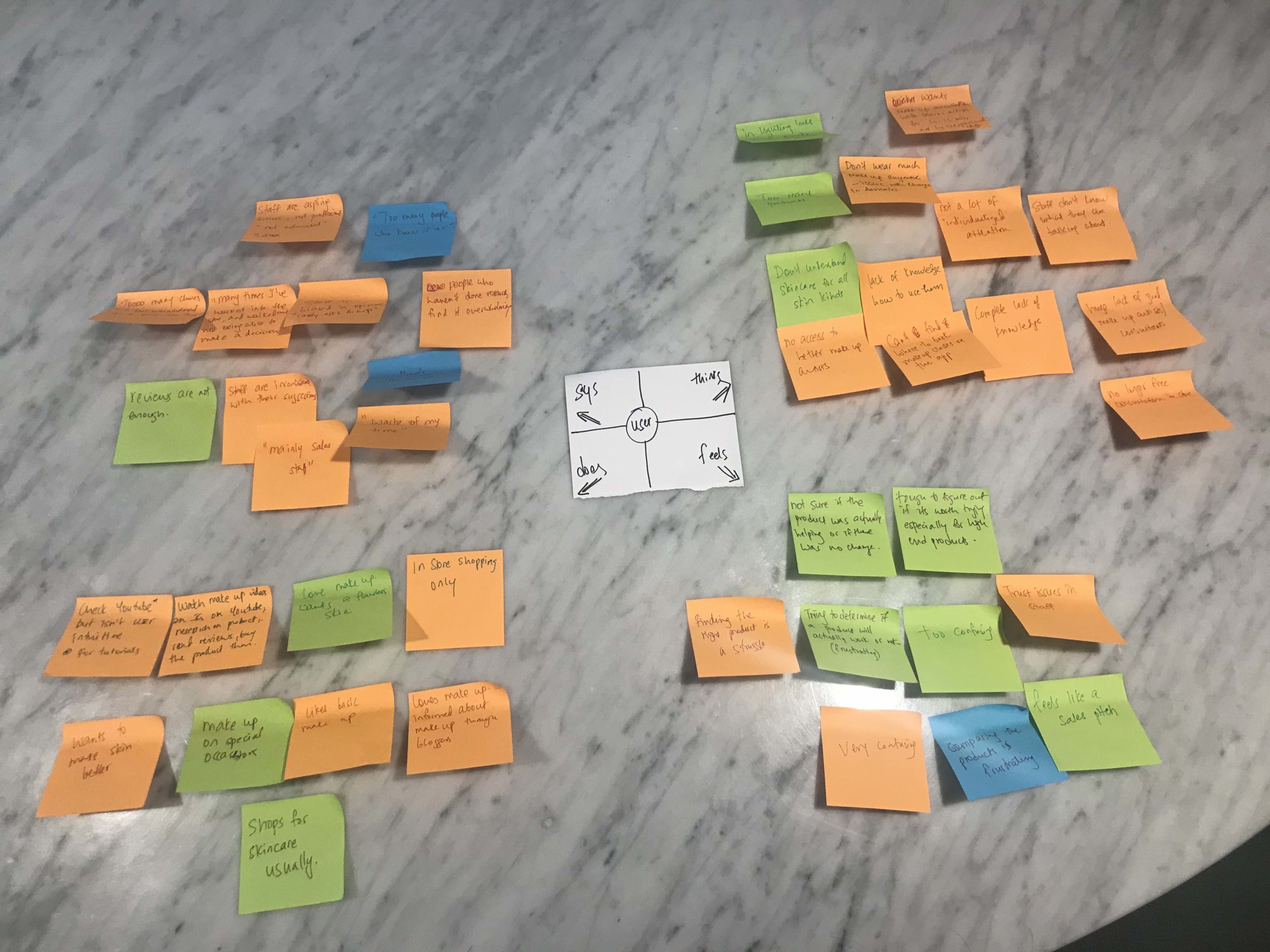
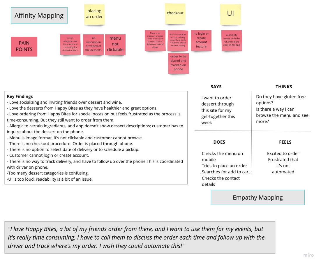
Key finding
Women, who are working professionals, love ordering cakes and desserts from Happy Bites to celebrate special occasions and get-togethers, but get frustrated, because the mobile version only has a menu in pdf format with no descriptions. This is a big pain point as many of them have allergies and want to read more about the ingredients and other details before ordering but the menu isn’t clickable and doesn’t provide more information.They then have to inquire and place orders over the phone and this is frustrating and time consuming.
“I love ordering from Happy Bites, but am unable to browse the menu so I have to discuss and place the order over the phone and this gets tiring."
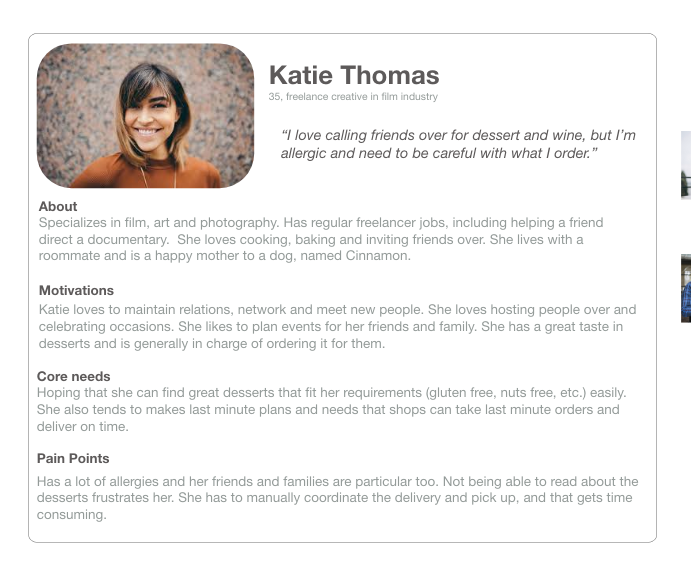
User Persona
Stage 3 – Ideate
How might we make it an easy experience for users to order desserts?
Design Strategy
I created a Venn Diagram to reflect and align business, users and technical goals for Happy Bites. We wanted to make sure we’re advocating for the user to create the best user experience possible, while acting in the best interest of the client.
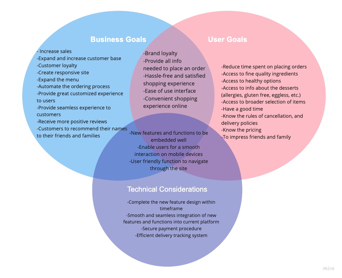
Have fun browsing desserts for your special occasions and have a seamless way to place an order, customize its details, and track delivery on the day-of.
Design Studio
To begin our ideation phase, I conducted a design studio with our team which included the owners, their UI designer and one volunteer from the company’s team. This was a great way to generate new designs and ideas about the project.
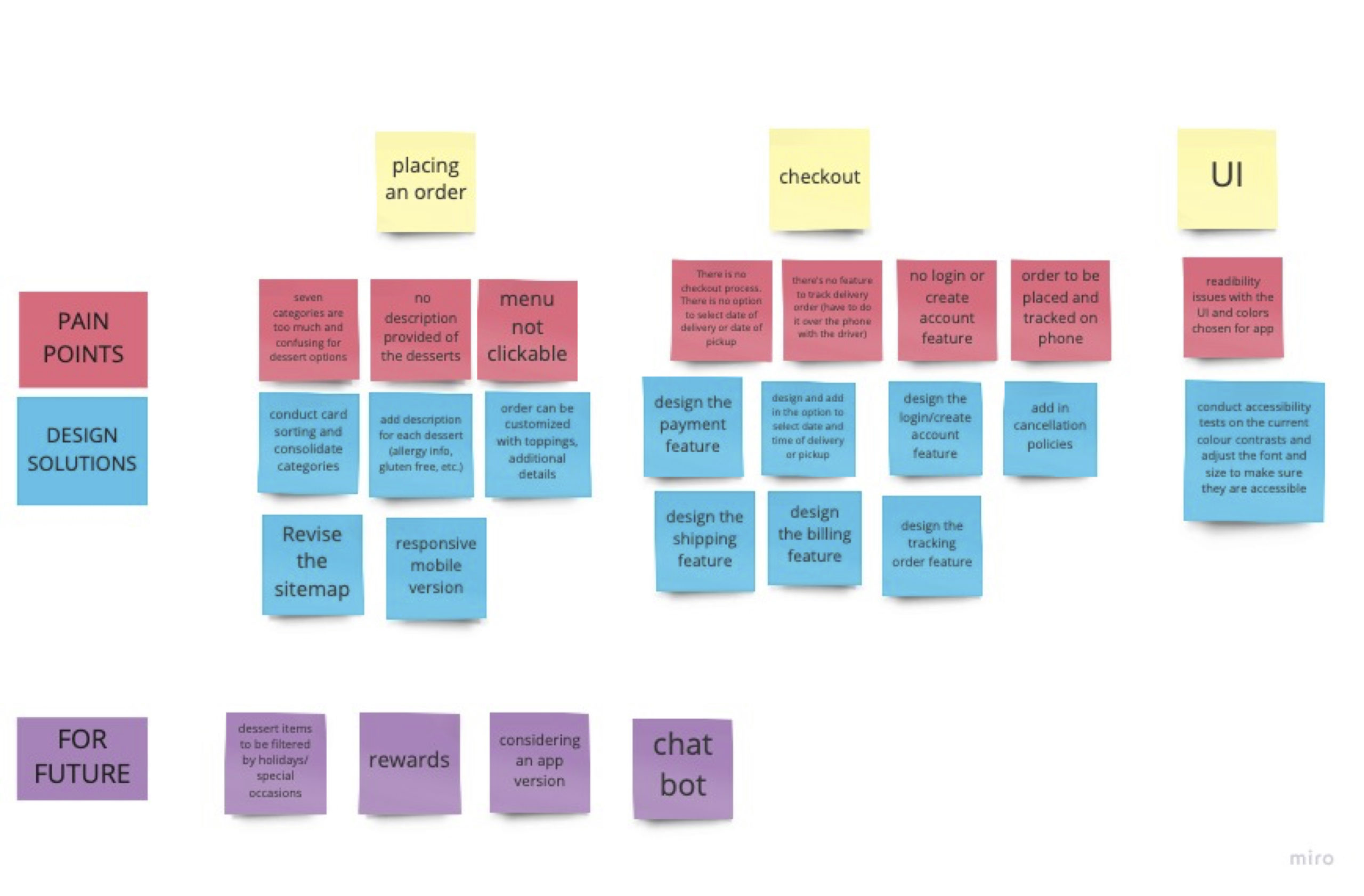
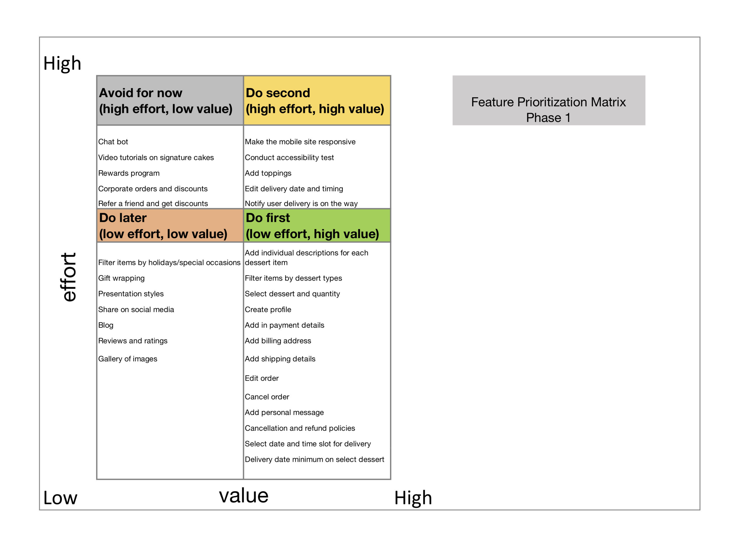
Feature Prioritization
We discussed our suggestions with the owners and their developer and it was agreed that for Phase 1, we would focus on building the functions prioritized in the green section.
Phase 1.1
Design the placing order process, by adding descriptions of desserts and the menu browsable.
Phase 1.2
Design the checkout process by being able to edit the order and setting up the payment gateway.
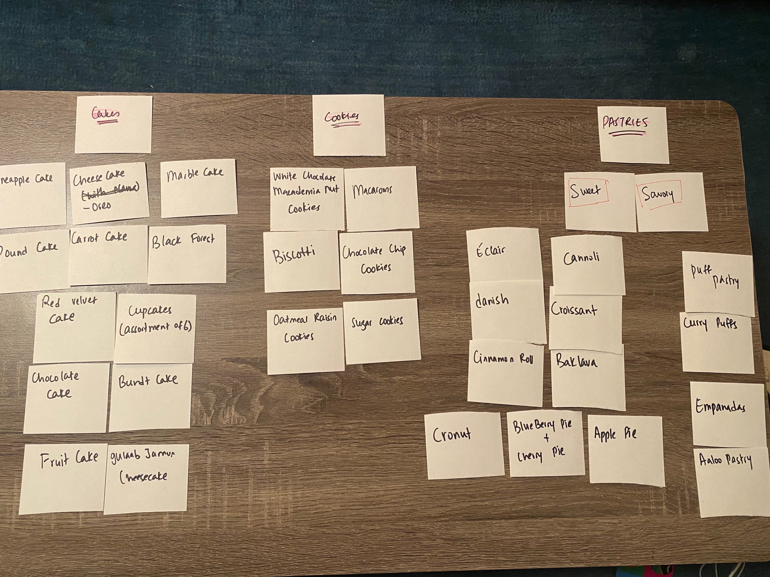
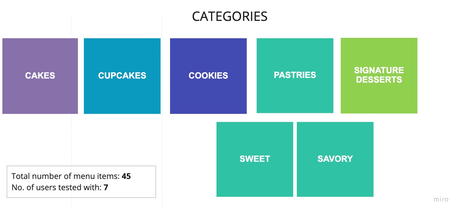
Closed card sort
Since we were time-bound and low on budget, we researched how other bakeshops categorized their menu, and then conducted an open card sort among our team and came up with 5 categories.
We then conducted a closed card sort with seven women, gave them 45 items and asked them to select which category it belonged to.
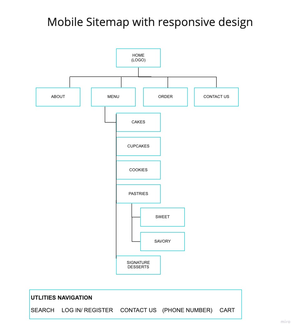
Sitemap
User flow
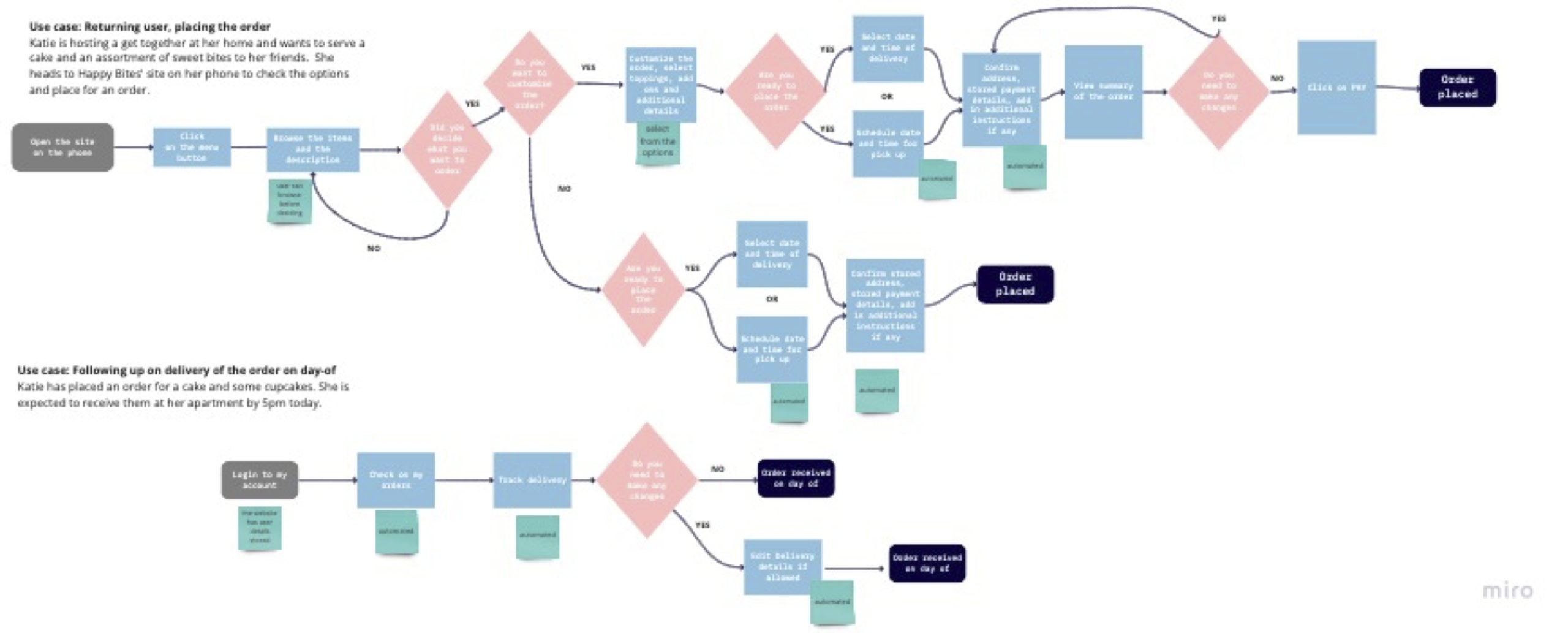
We created a user flow for different scenarios and created a comparison current user flow vs revised user flow, pointing the pain points in red at each step in the current user flow and how we’ve solved it in the revised flow in green..
New user to place the order, current user flow
New user to place the order, revised user flow
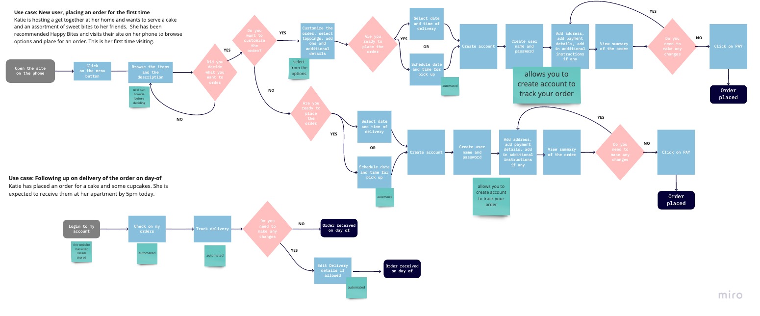
Returning user to place an order
Responsive Design
We made sure the information was stacked in the correct hierarchy and that the font sizes were appropriate for a phone.
Stage 4 – Prototype
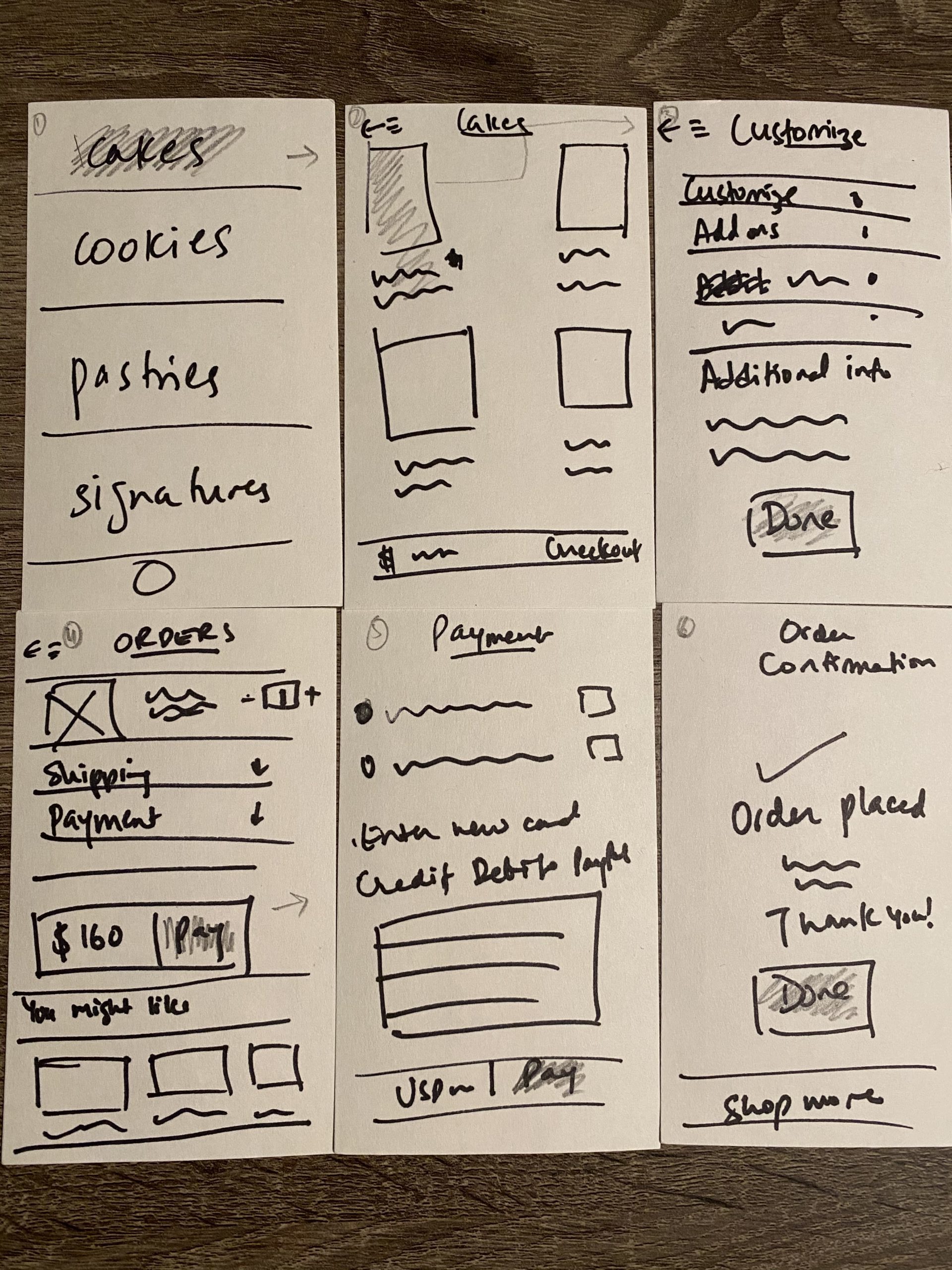
I started with creating paper sketches to make a layout of our design. I then created low to mid fidelity wireframes.
Paper sketches
Low to mid fidelity wireframes
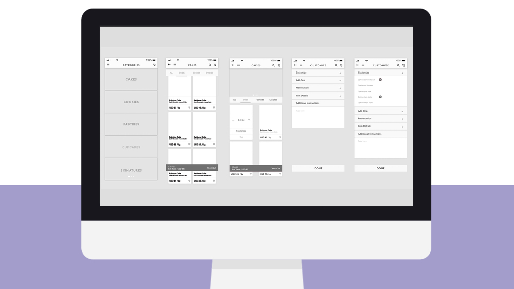
High fidelity prototype walkthrough – version 1
This is the high fidelity prototype of the first iteration with the colors.
Note: only paper sketches and the high fidelity prototype of the first iteration are permitted for sharing. Final wireframes, prototypes and UI designs are protected under NDA.
Revised UI
They have a fun, whimsical personality to their brand and we suggested a style guide that represented that company culture. We also made sure the colors were in line with principals of accessible design.
I conducted accessibility tests on the current color contrasts being used to see if the information was digitally accessible. Some of the color contrasts were not, and therefore we adjusted the font and size to make sure they were accessible. Accessible text colors are generated with WCAG Guidelines recommend contrast ratio of 4.5 for small text or 3 for large text which is 24px or 18px bold.
Stage 5 – Test
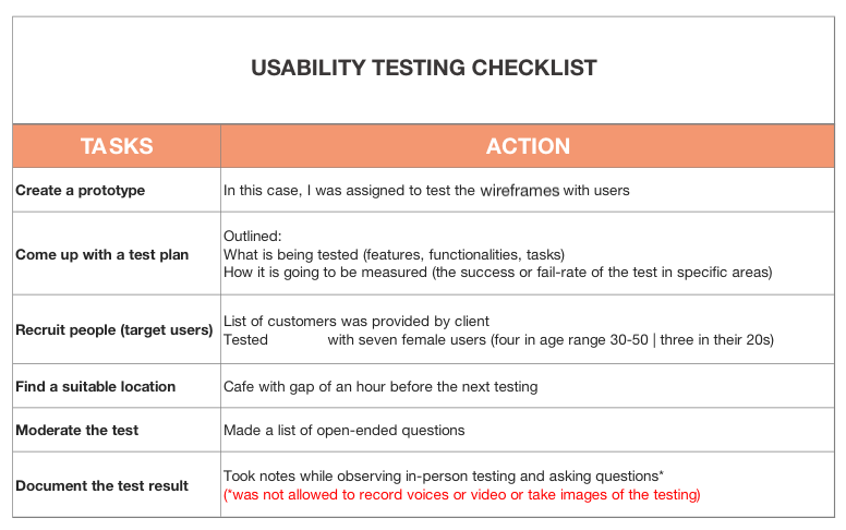
Guerrilla Usability Testing
Since we had a tight budget and limited resources where we were heading towards COVID, we wanted to get an idea early on to make sure we’re going in the right direction. Our approach was guerrilla testing. We did the first testing with paper sketches with 5 users to quickly test our design.
We followed 7 steps to conduct Guerrilla Usability Testing.
- We came up with a list of tasks
- Prioritized the tasks (in this case it was to browse and place an order)
- We turned our tasks into scenarios and wrote a script accordingly
- Started the guerrilla testing and completed in a day
- Captured the testing insights by summarizing the key big wins and problems
- Tweaked and fixed the usability problems and made it a mid fidelity prototype
- Tested with the users again
Usability Testing Checklist
The User Task
“You want to place an order for a birthday cake for your husband, to be delivered to your place tomorrow by 5pm. You’re deciding between the pineapple and the red velvet cake as he likes both! You also want to add in a personalized message for him. How would you go about completing this task?"
Script
Inspired by Steve Krug’s guidelines, I ran the following script with the users, but made it more casual. The challenging part here was, I was not allowed to tape any recordings, so I had the UI designer accompany me in these sessions so we both could take notes and make sure we haven’t missed out any key points.
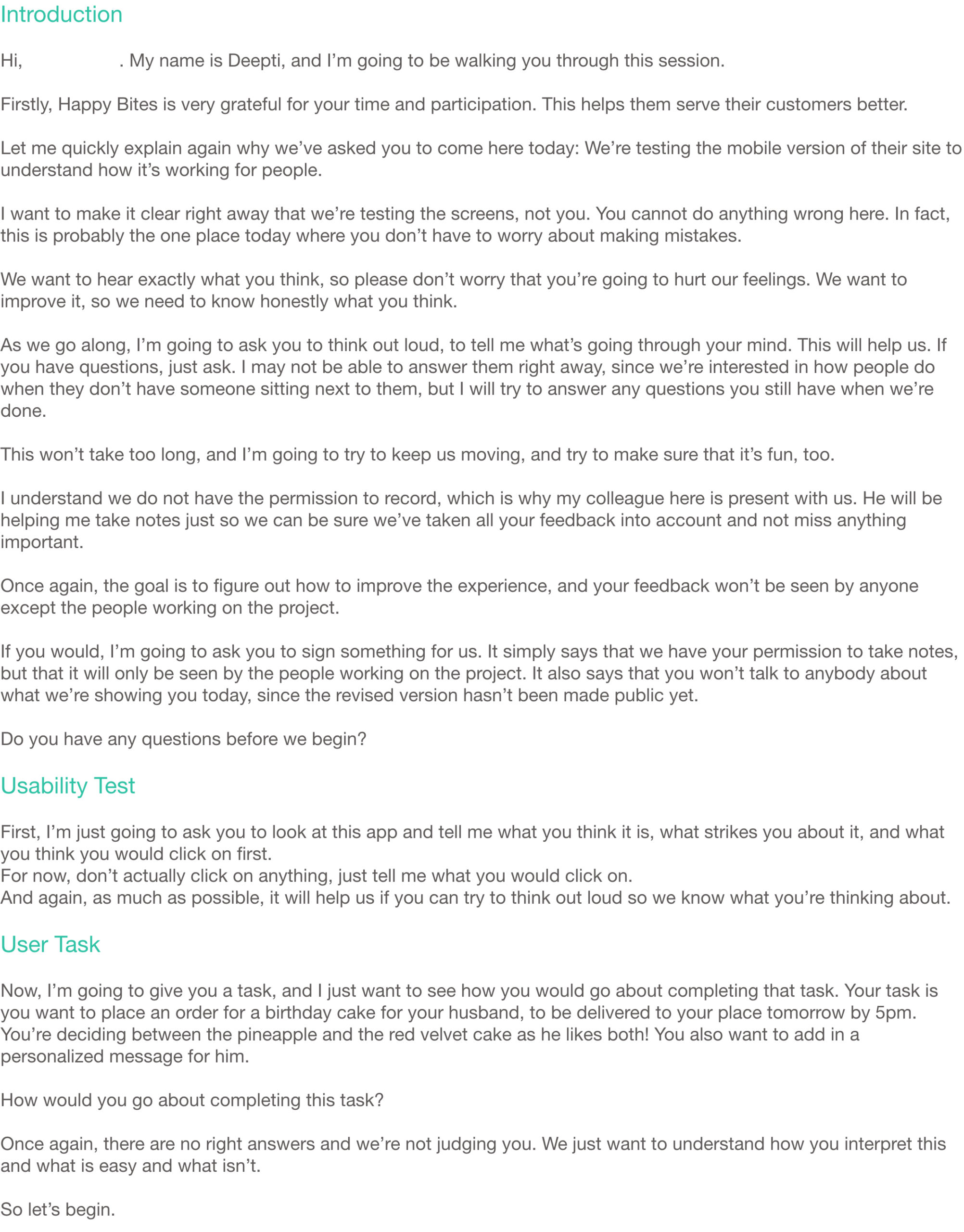
Discussing the test with users
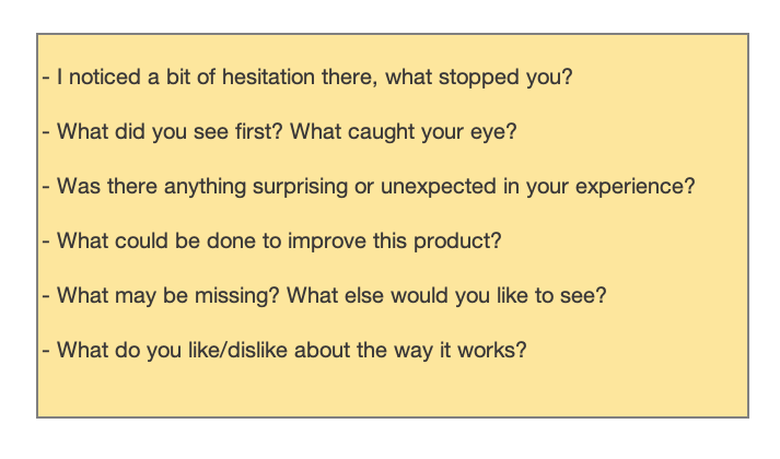
To understand the users’ needs, behaviors, goals, and frustrations, I made a list of open-ended questions that would not lead them.
User feedback
The biggest feedback was that they felt it was easy to navigate. Some users liked being able to create account, but were also wondering if they could place an order as a guest. The other concern was how can a user track delivery of the order on the day-of.
“This makes it so much easier for me to place orders! I can now browse and compare between options before deciding what I want!"
“I don’t have to call them and discuss the order anymore! It’s easy to understand and the steps are quite straightforward!"
“This has just saved me so much time. All the information that I need before placing an order, is here!"
“I love it, but I don’t want to create an account. Can I still place an order?"
“This is so much better! I’m going to continue ordering from their site. Is there a way to track delivery though?"
Stage 6 – Next steps
- We submitted low-fidelity wireframes to show how users can track delivery on the day-of. This is currently under review.
- We were asked to help revise the sitemap of the overall website which we should begin working on soon.
- Conduct click testing once things get better, to determine how users use the available UI components and which navigation elements are used and which are overlooked or avoided.
Reflection
The sisters were a delight to work with. A lot of change was needed and with budget and time constraints, the biggest challenge was prioritizing what needed to be shipped first, as everything felt like a priority! This being one of my first few projects, I wanted to make sure I’m giving the right advice so I put in a lot of research on the best methods to use in research and testing – and I’m glad we adopted the guerrilla approach. We had to be creative in generating info and I’m glad it was a success.
Few weeks later, the sisters let me know that their website was updated with the first phase. Seeing that was so fulfilling! A lot of my suggestions have been implemented and that was rewarding. Their customers seem to be raving about it and this makes me very happy.
“I really enjoyed going through your slides, and the research and ideas you came up with. We’ve covered a lot and it’s great to be part of the process and see you implement our feedback into your design solution!" — Developer
“The presentation was great as were the solutions. You have helped us a lot.” — Client
[ez-toc]
Business goals
- Testing