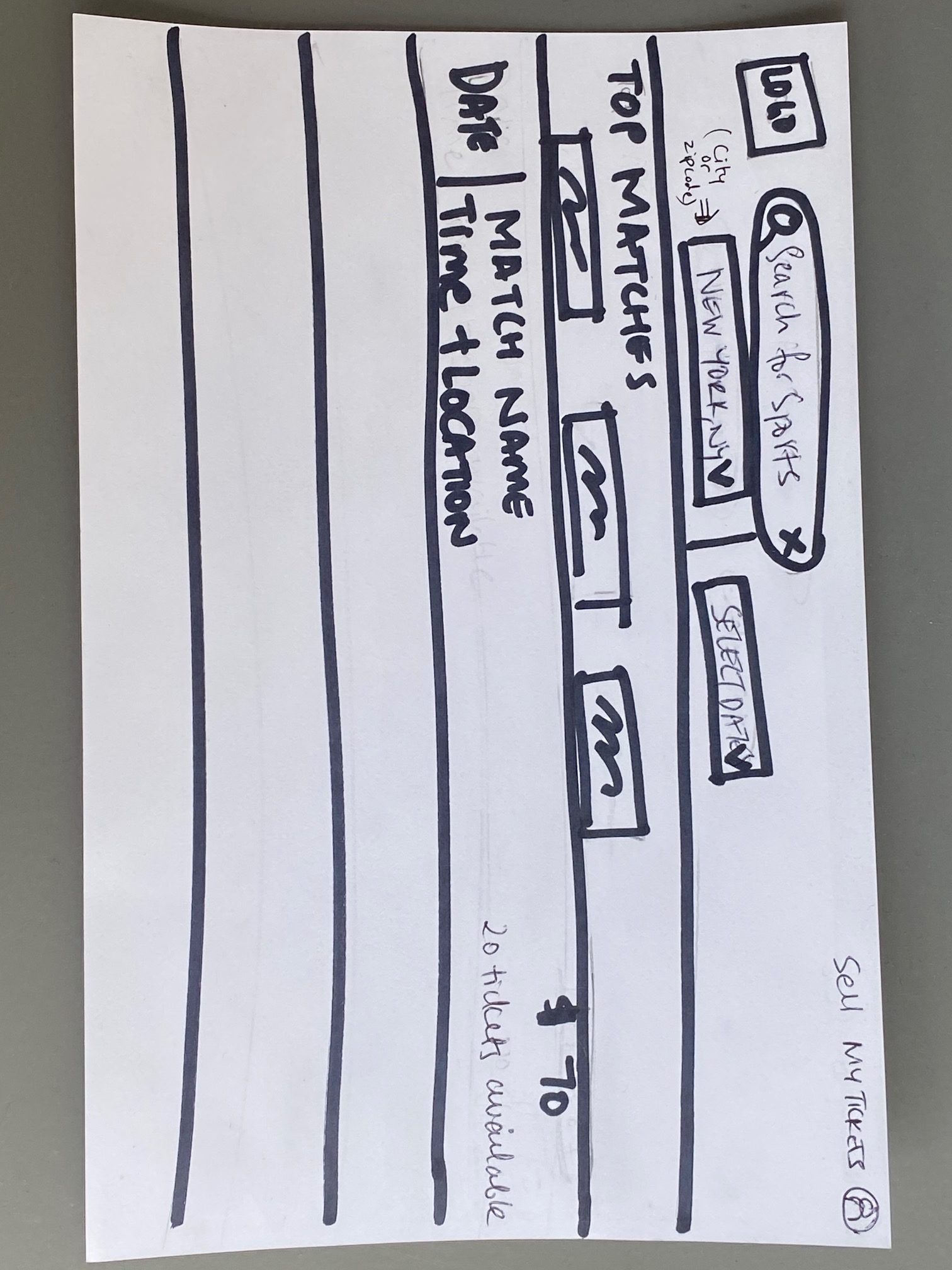
Today’s challenge was: A search results view for a ticket purchasing site to help sports fans.
- Difficulty level: Easy
- Time to solve the challenge: 15 minutes
- Assumption: Here the assumption is the sports fan is a returning user

Thoughts leading to the design
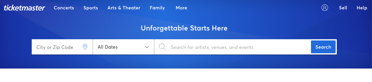
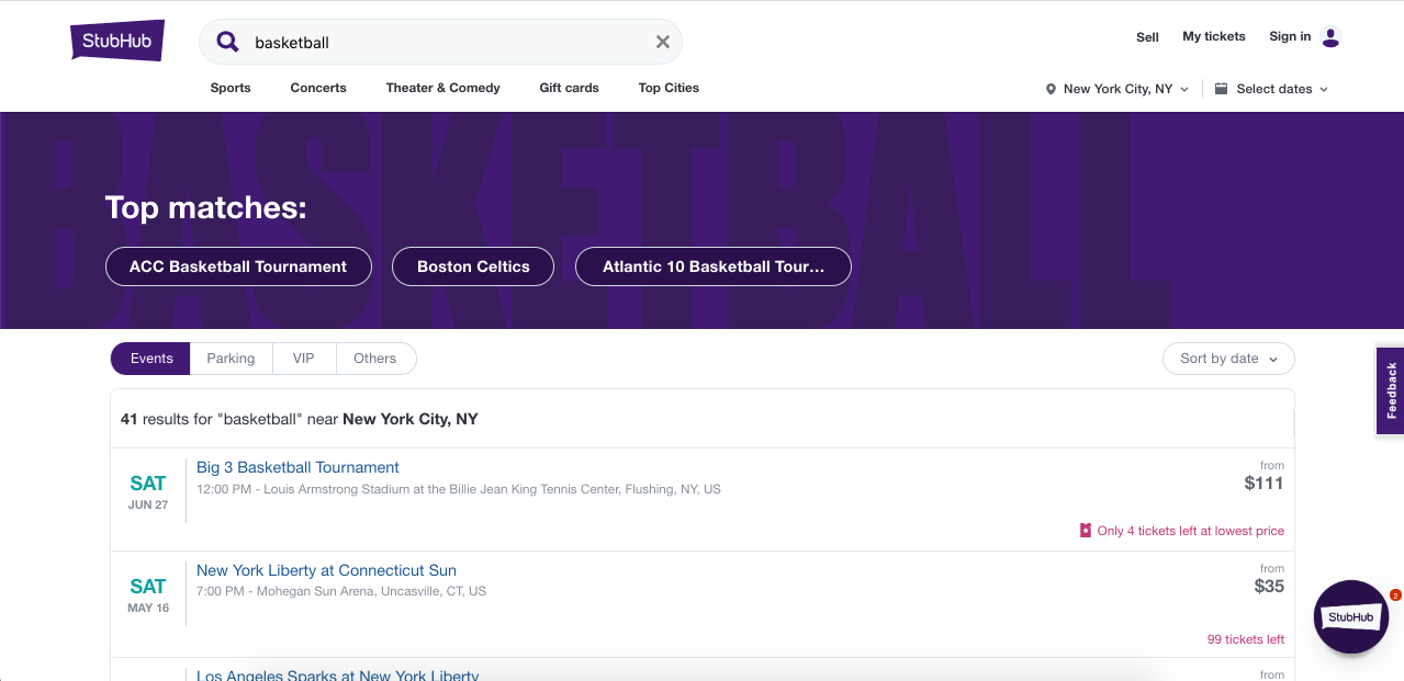
I’m not much of a sports fan, so this one was a little interesting for me to think like a sports fan and what they’d want as part of their search results. I took inspiration from Ticketmaster and StubHub – both sites that I use a lot. Between the two, I like the single-row view of the search buttons at Ticketmaster and I love the design of the search results at StubHub.

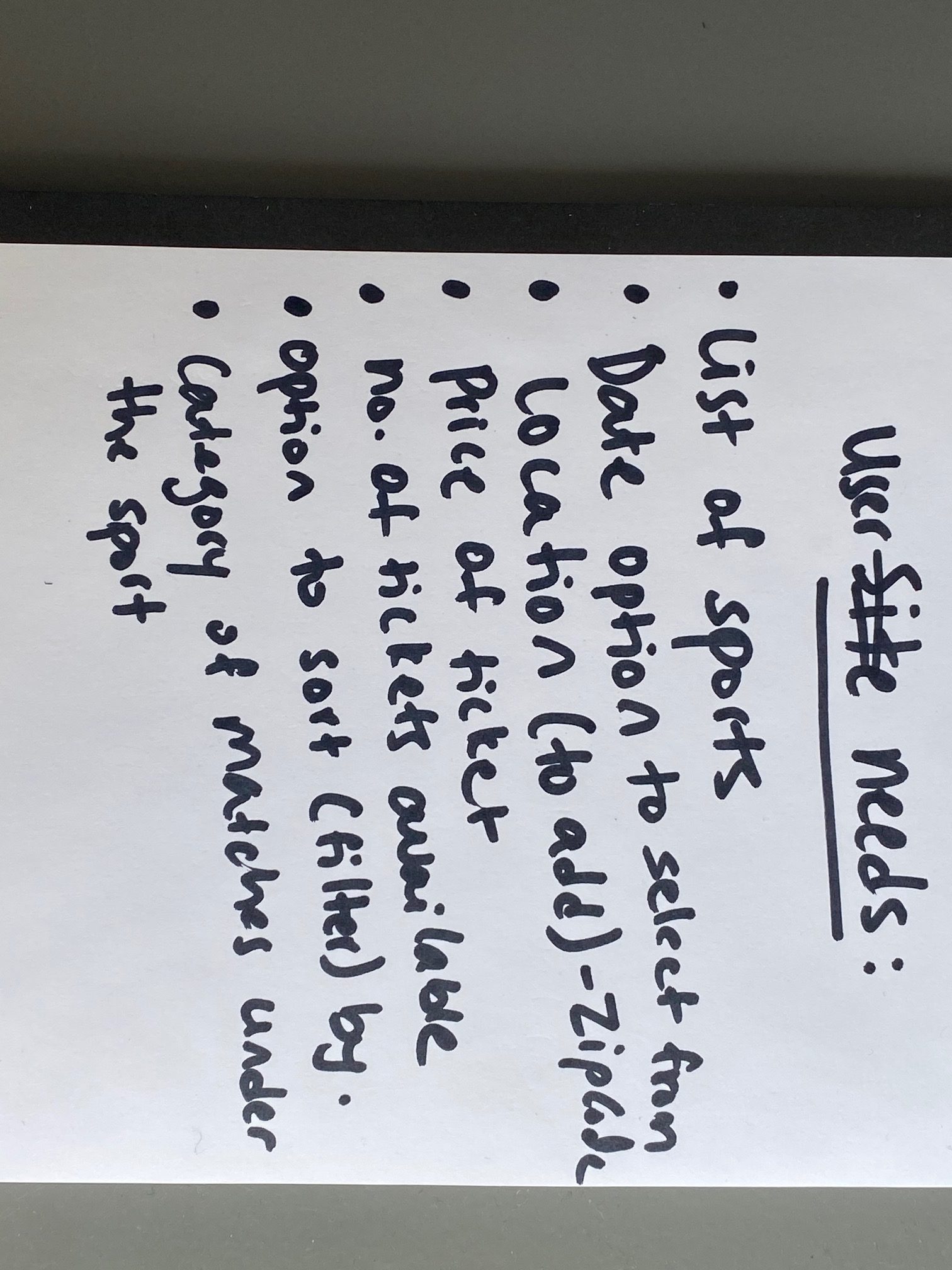
I listed out what I believe a user (sports fan in this case) would want to see in their search result and then made the design. The category of matches under the sport denotes the teams which the user can filter by.
The final design
Here I included the ‘search for sports’ on top and beneath it, added the ‘enter city/zip code’ and ‘select date’ next to each other. I like having everything related to search details to be next to each other, all in one row or one after the other. It’s distracting when there’s too much space between the two (like in StubHub).