Corwin Online: Website Redesign
Project Overview
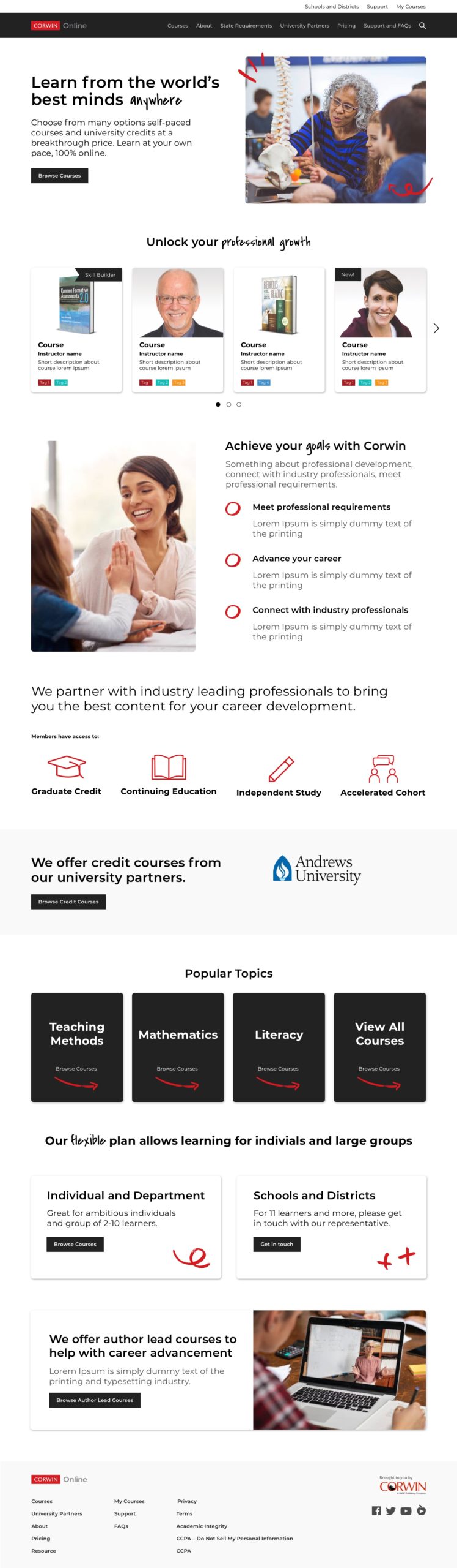
About
Corwin Advance focuses on online learning designed to support teacher license renewal and professional growth. It offers several different formats of online courses for direct individual purchase (B2C) or group purchase (B2B).
Brief & Duration
Redesign and improve user signup and payment process for their courses and recommend ways to ensure users have access to courses specific to their specific state licenses/certification.
Duration: Five weeks
My role
I worked with the Product Designer and my role was to conduct a heuristic evaluation of how users navigate through the site, identify pain points and brainstorm together on how to redefine the structure of their website, necessary pages, site navigation, and organization of site content.
Tools & Method
Usability Evaluation, Competitor Research, User Personas, Content Hierarchy, Sitemap, Task Flow, Wireframes, Mockups, Visual Moodboards (icons, colors, typography, image style, buttons, links, content).
Tools: Miro, Sketch, InVision, Figma, Thought Industries platform
Note: Detailed report is protected under NDA. Sharing parts that are permissible.
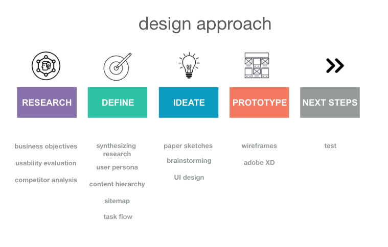
Stage 1 – Research
How can users have a great experience in accessing and browsing courses that cater to their needs?
“How can we make the user signup and payment process easy?”
Usability Evaluation
After meeting with the client and understanding their requirements, our first step was to evaluate the website’s existing navigation. We did a heuristic evaluation of the user flow for first time users and identified pain points and areas of improvements.
*Detailed report with key findings, protected under NDA.
Key Findings
- Many ways to reach the website, most of them were unknown to users, and searching for the link was hard
- High bounce rate: most CTAs took users out of their website to an external link without ways to redirect back to the site
- Payment and checkout was supported by a third party and the process was cumbersome, redundant and needed redesigning
- Information about courses were all over the place and needed to be restructured and consolidated
Poor SEO, high bounce rate, redundant third-party payment integration, weak structuring of key information.
Competitor Analysis
The client provided us with a list of their competitors, their strengths and and features that they liked in those websites and wanted us to focus on for incorporating it into our design.
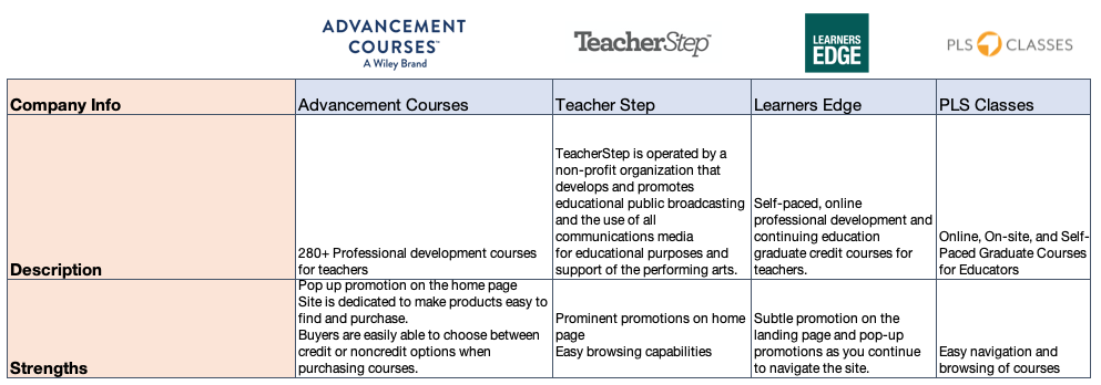
Key Strengths
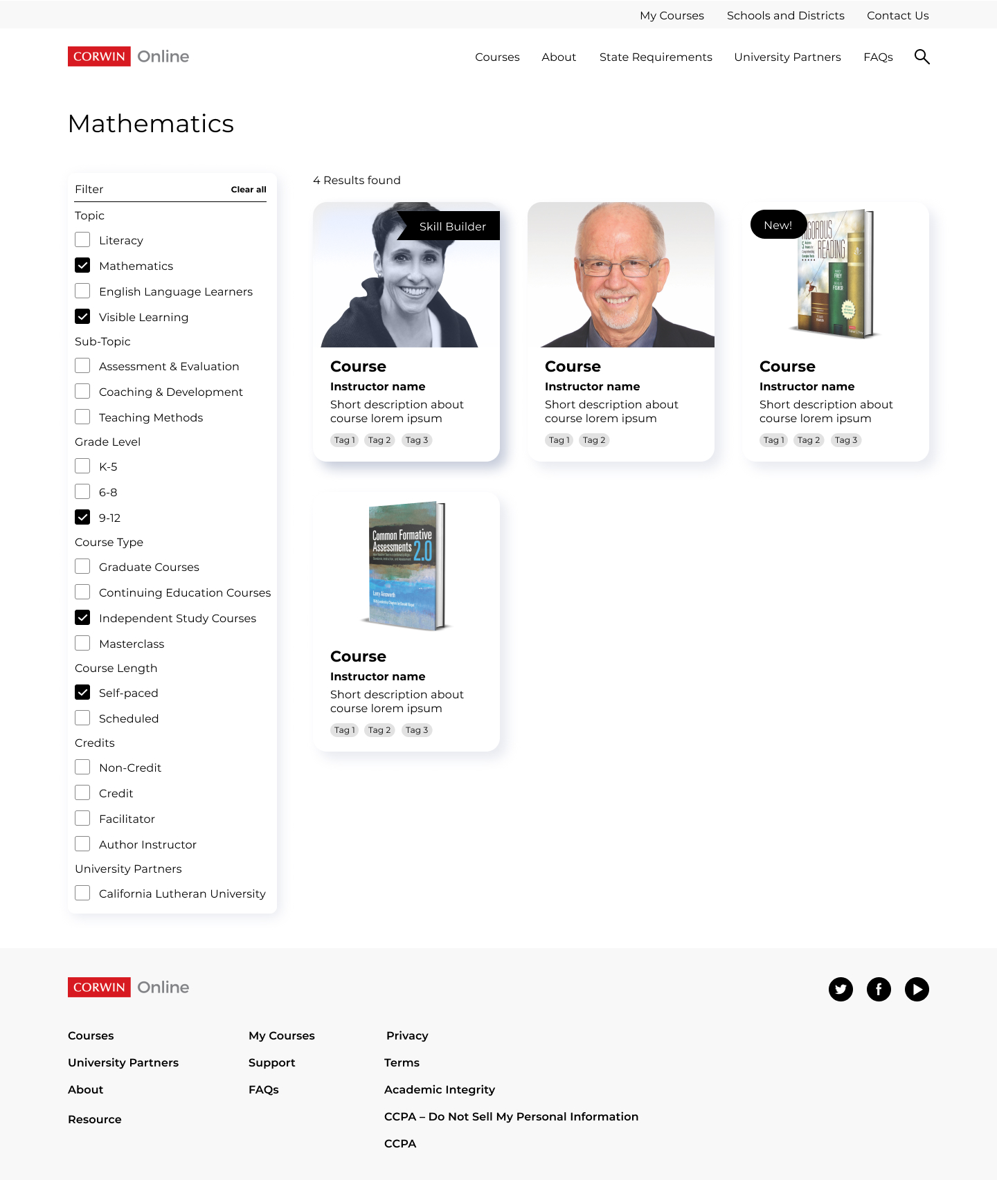
- detailed search/browse/filter functionality
- general ease of use and consistent messaging
- simple and robust purchase process
- Up to date promotions and banner content
Areas of improvement
- Busy UI
Stage 2 – Define
After running through the user flow, we brainstormed and listed the key persona, motivations, core needs of users and pain points.
Synthesizing data
User Personas
We then created user personas and identified three types of users: an individual learner, a group learner and a decision maker.
“I want to advance in my career.”
Content Hierarchy
The aim of creating this was to highlight business objectives, values of courses and align with user motives.
Sitemap
This was created to redesign the layout of the website so users can reach their end goals easily.
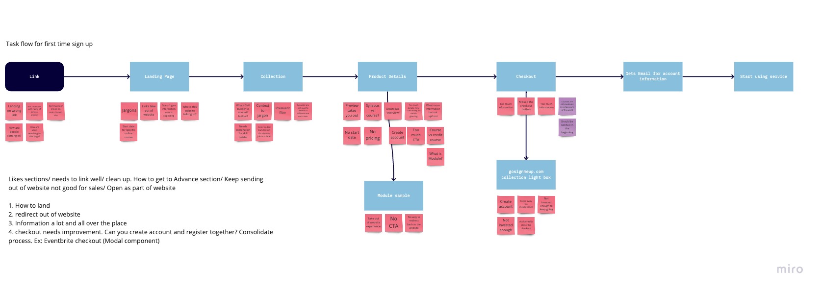
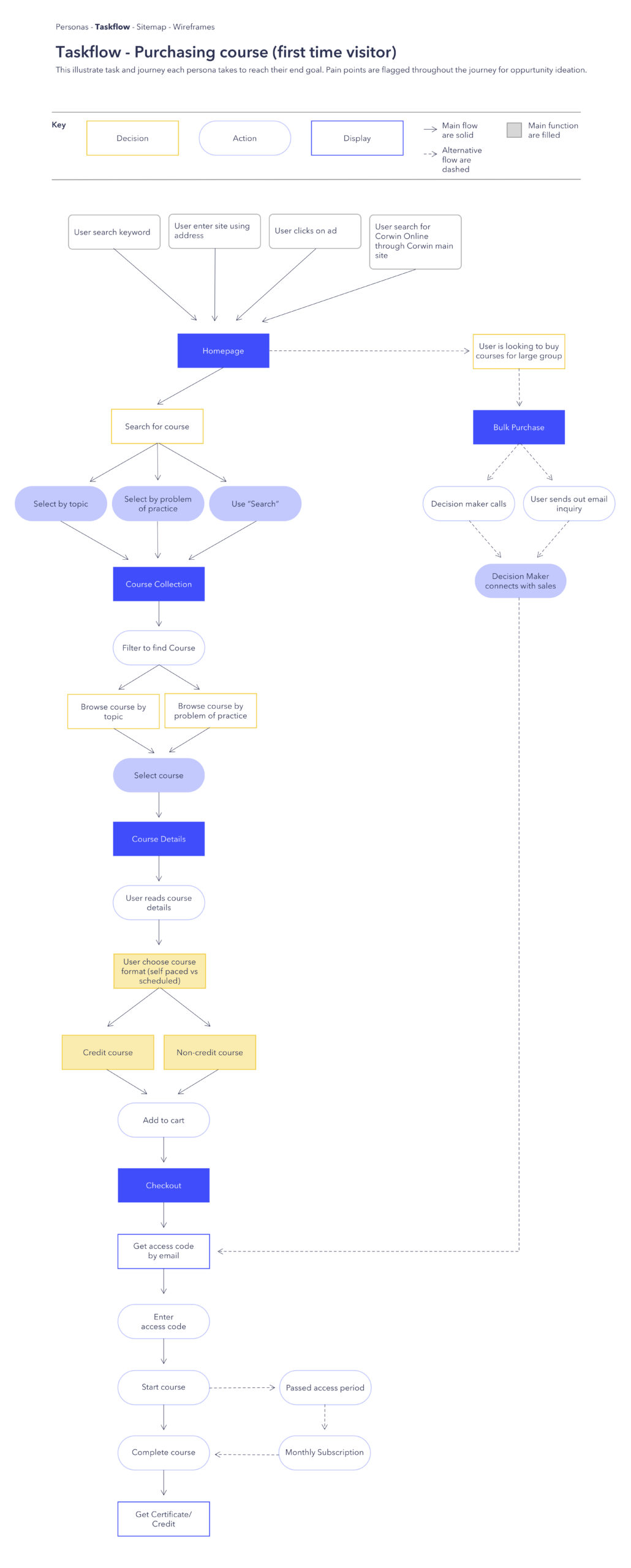
Task flow
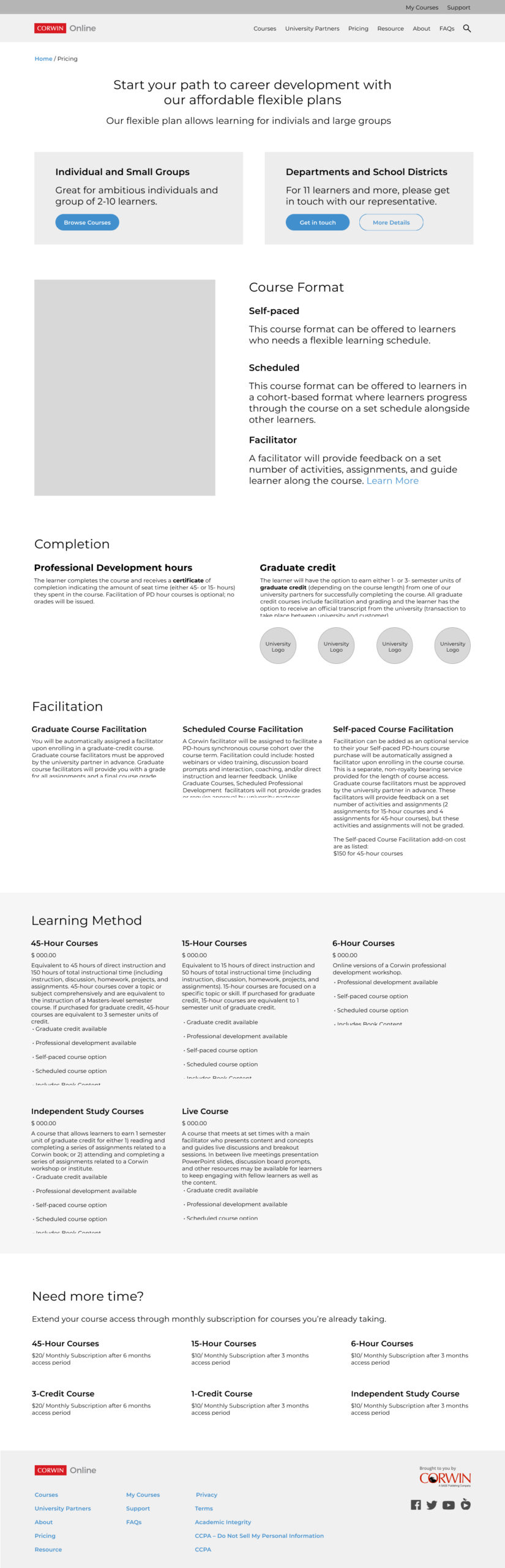
This is the task flow for a first time visitor purchasing a course on their website. We made changes to this after getting feedback from the client.
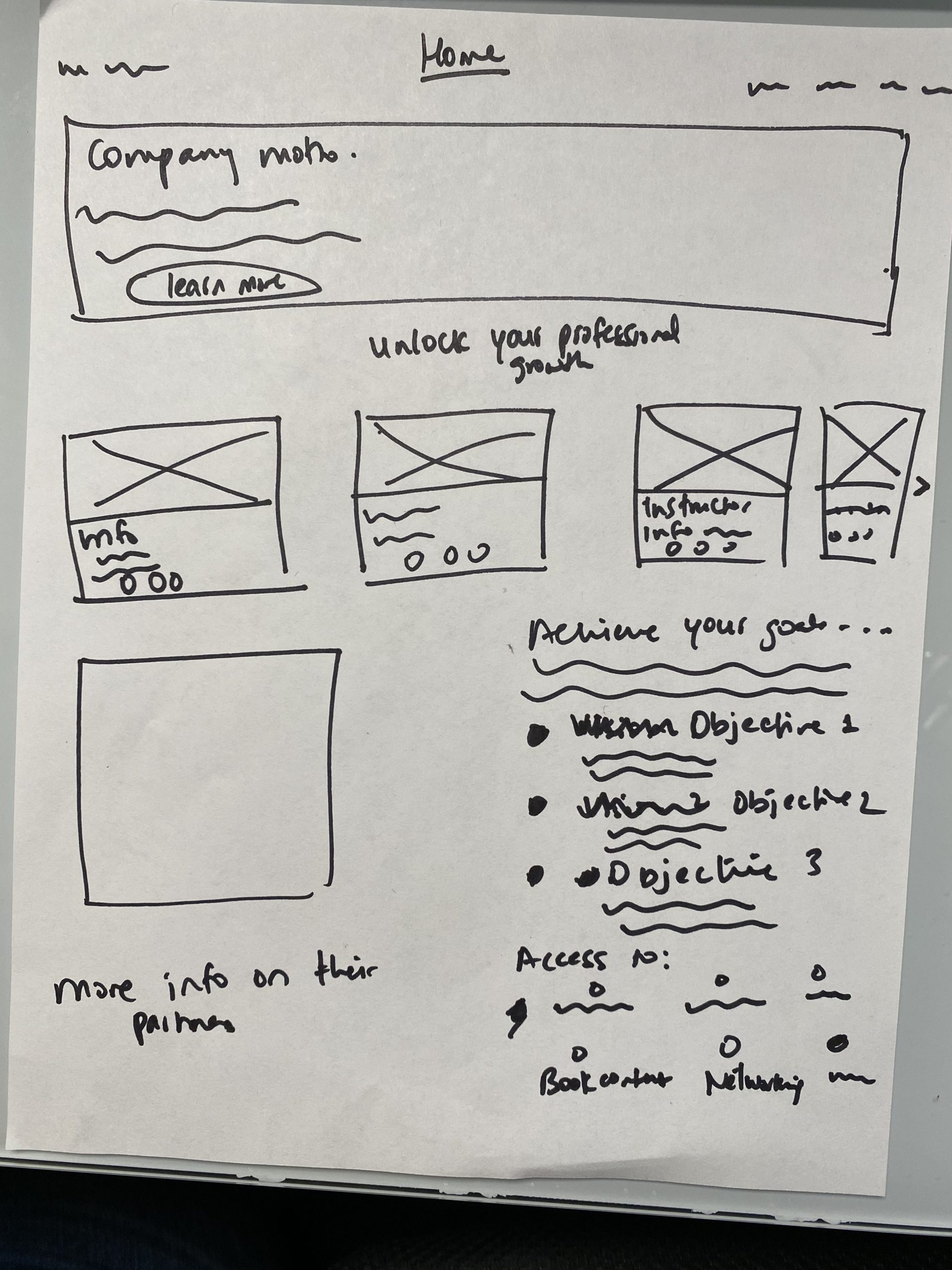
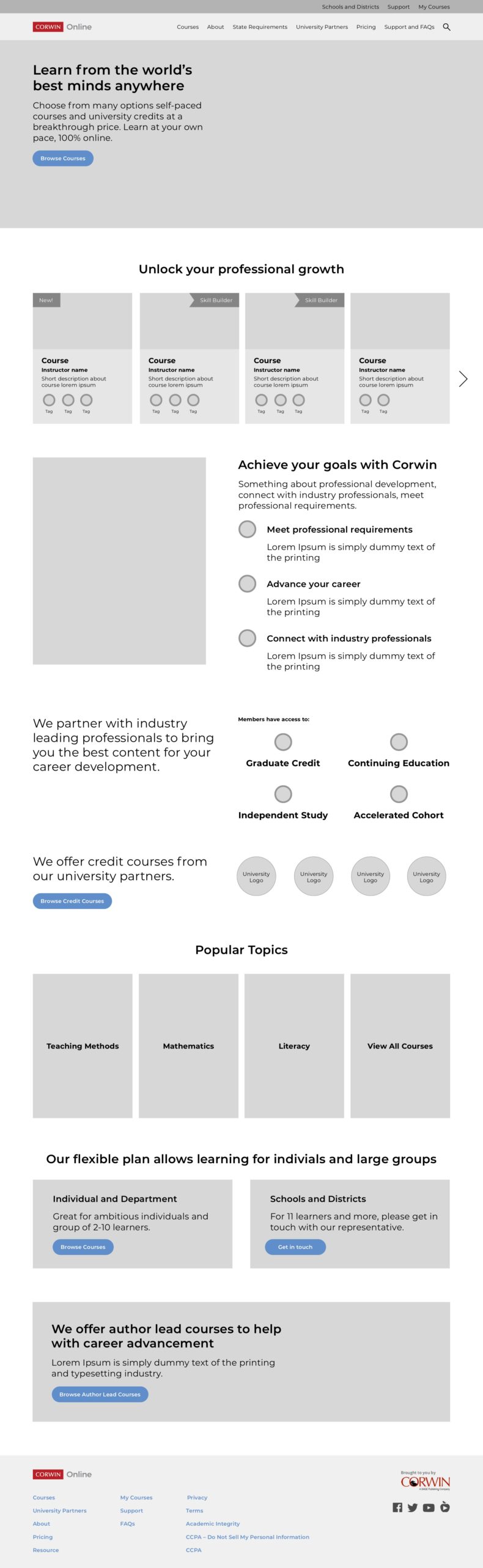
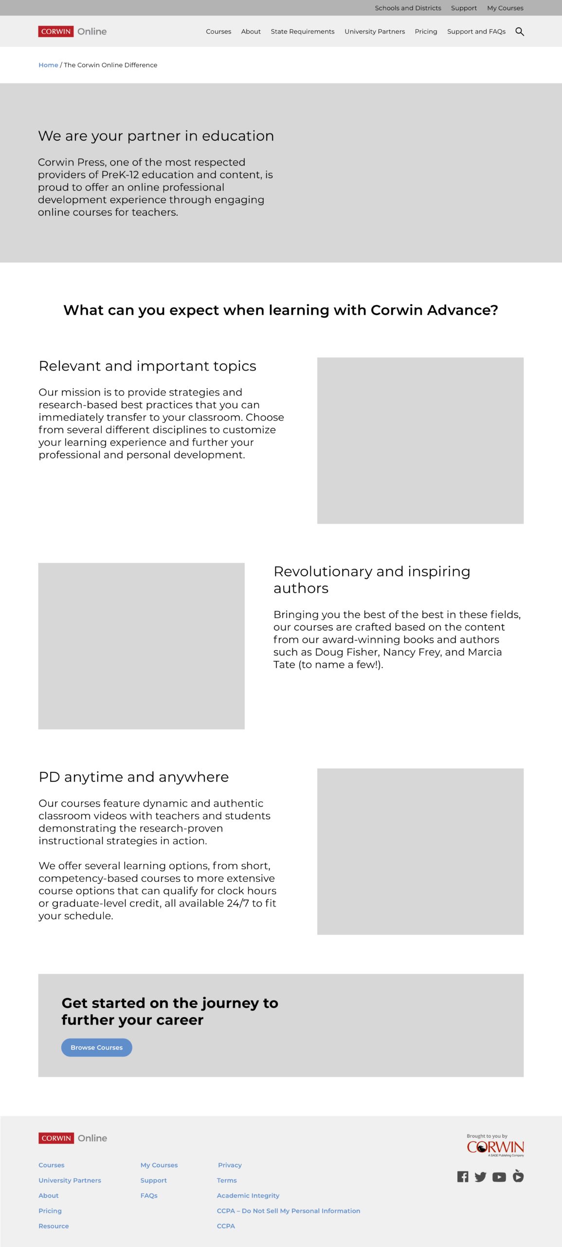
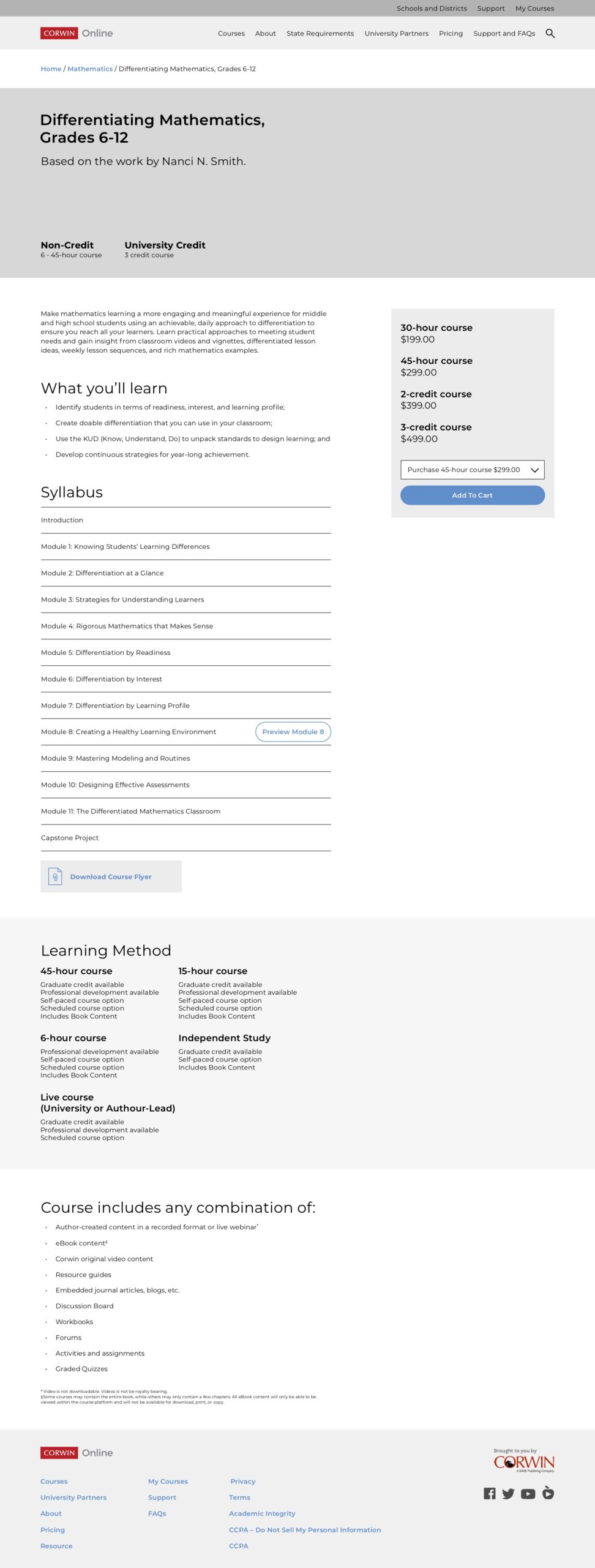
Stage 3 & 4 – Ideate & prototype
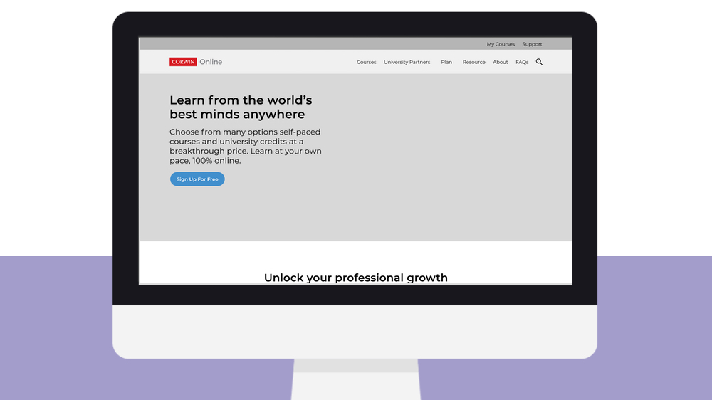
Since we were time bound, I quickly made paper sketches, followed by mid-fidelity wireframes to get a clear direction of where we’re heading. Once the client approved the direction, we proceeded to creating mockups.
Paper sketches
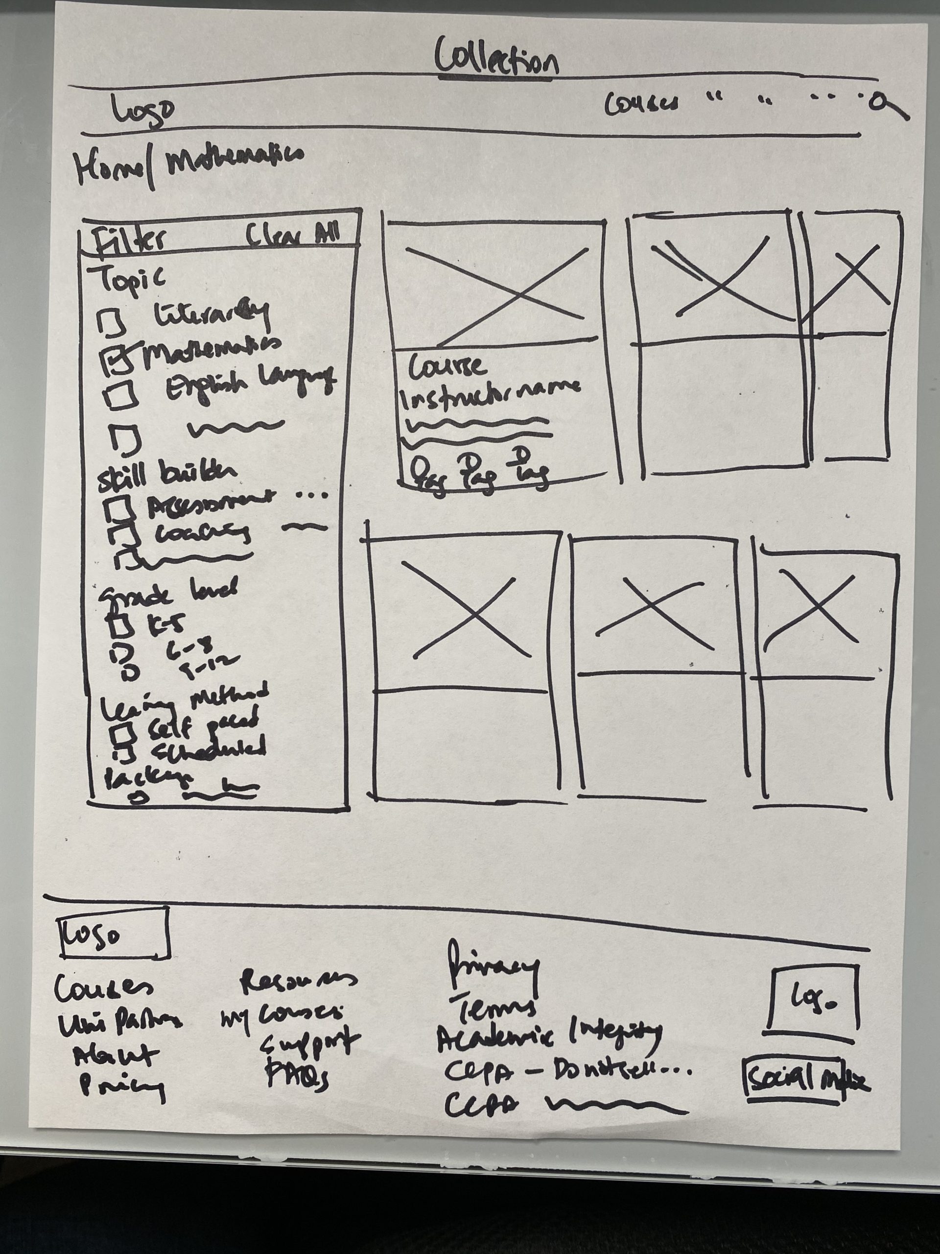
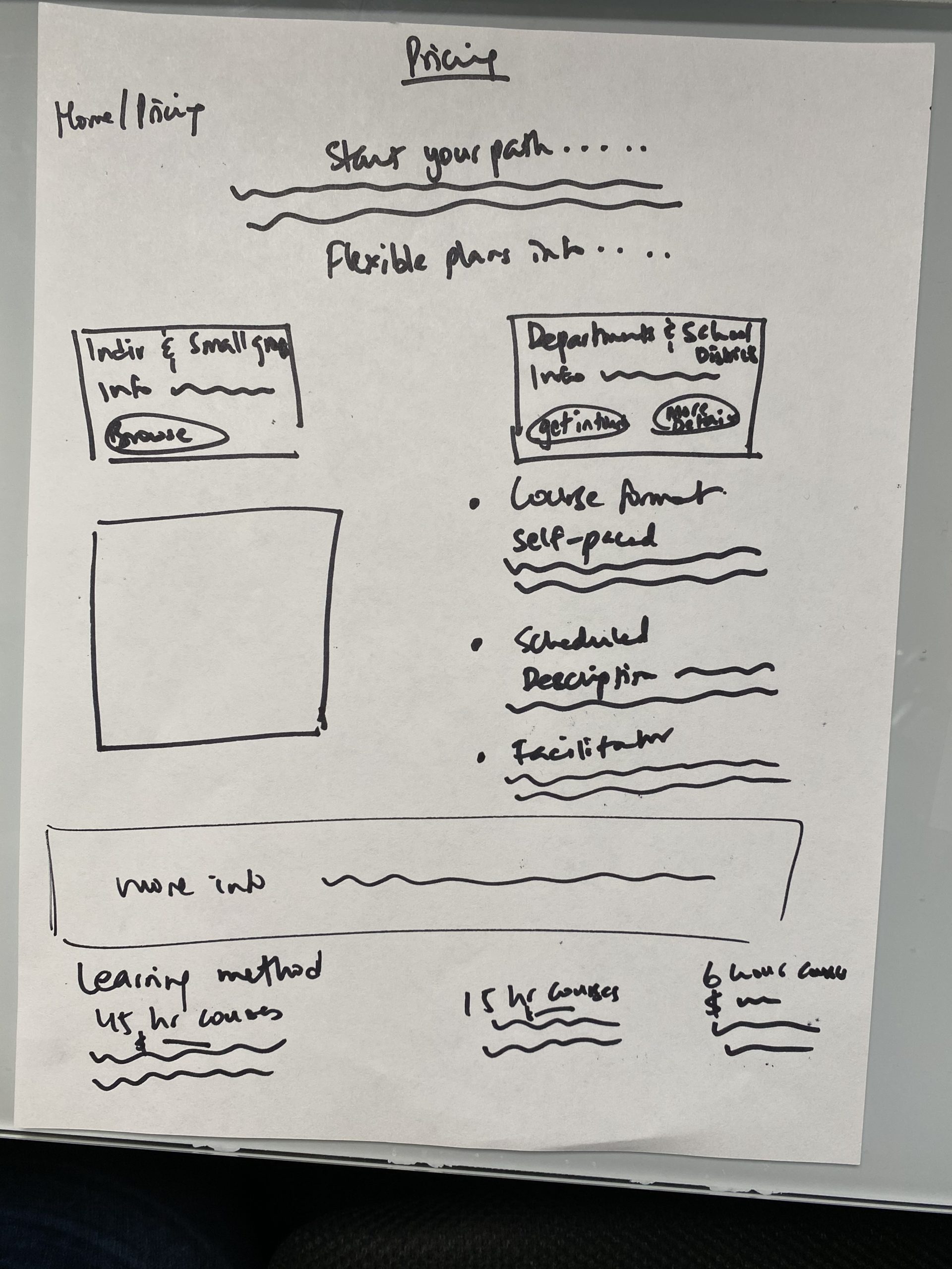
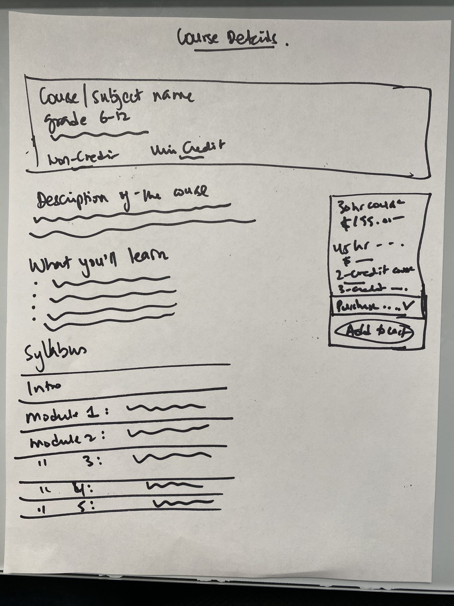
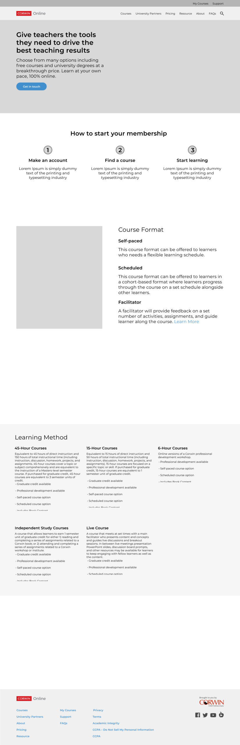
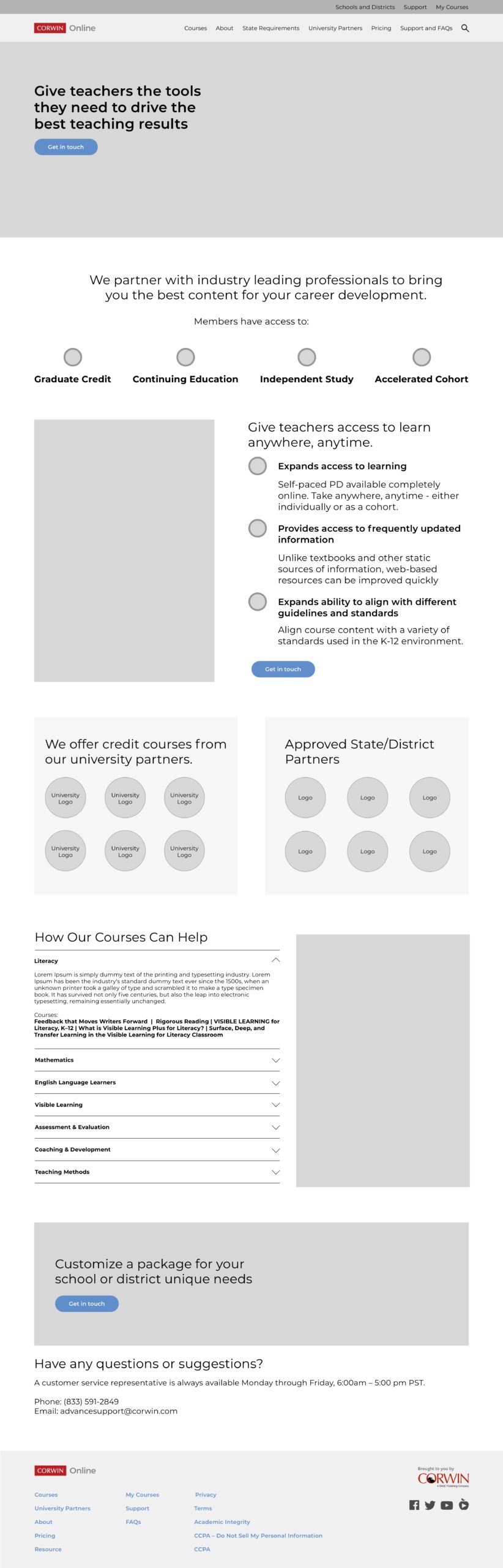
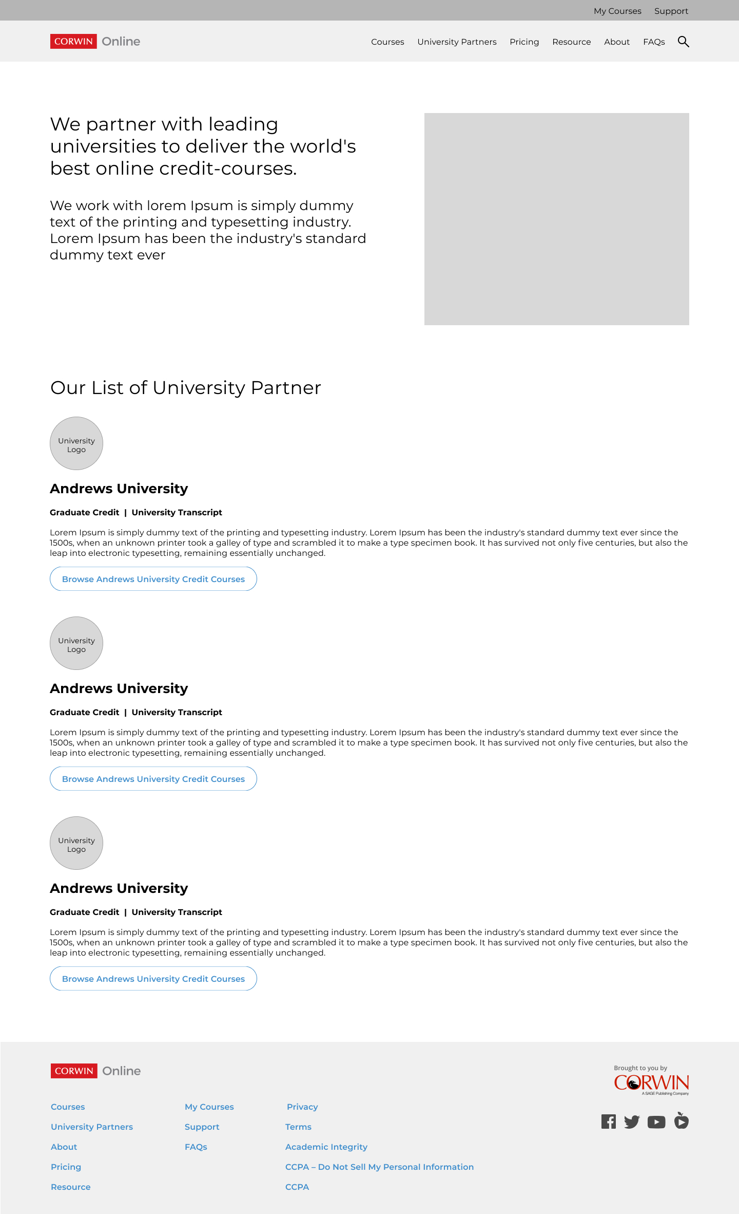
Wireframes
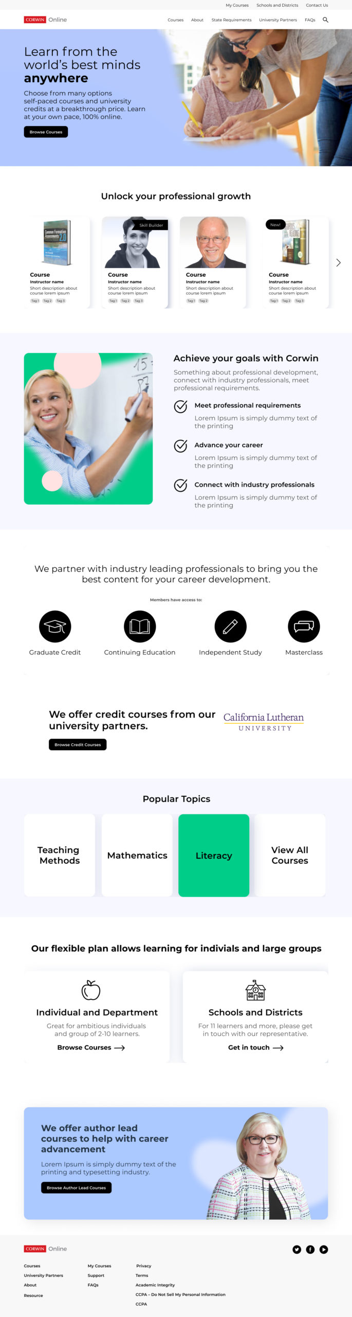
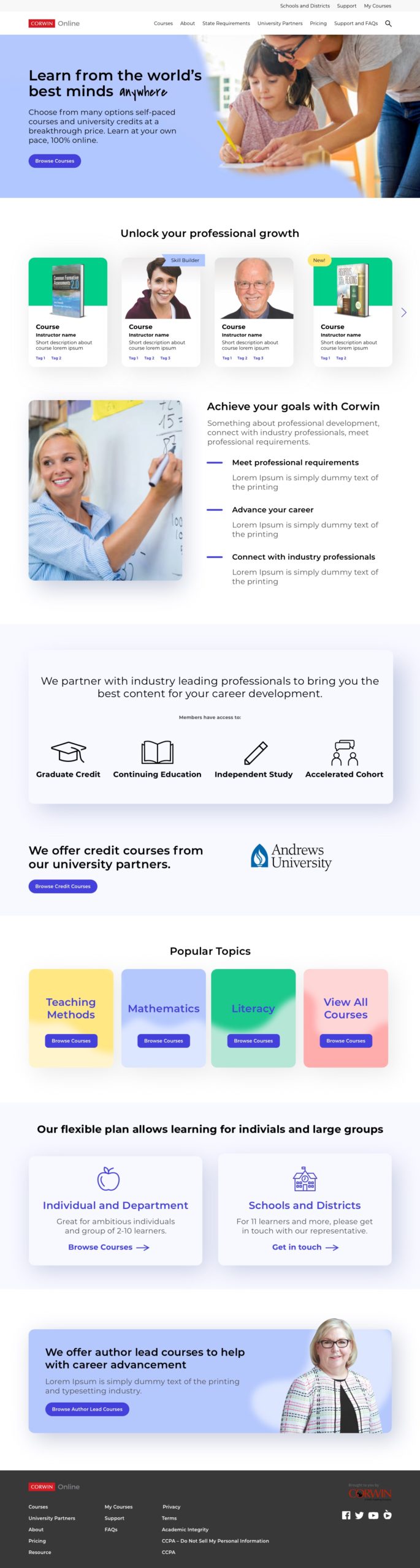
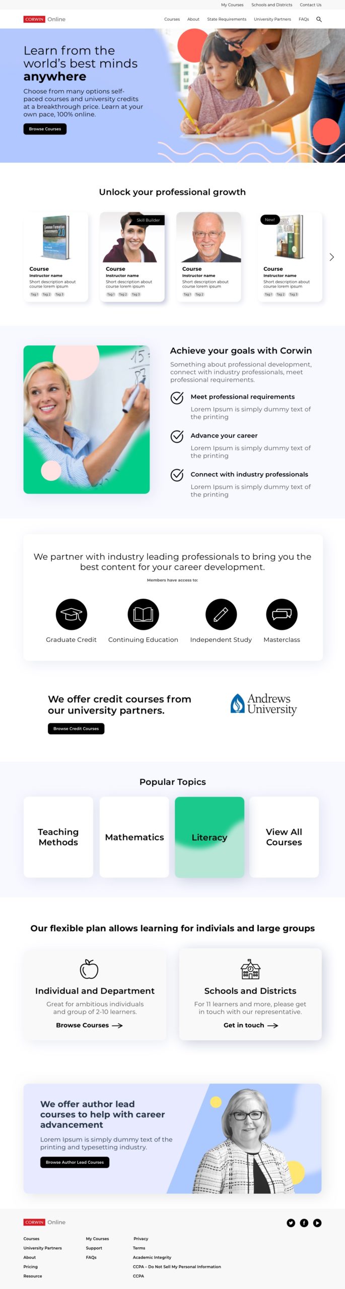
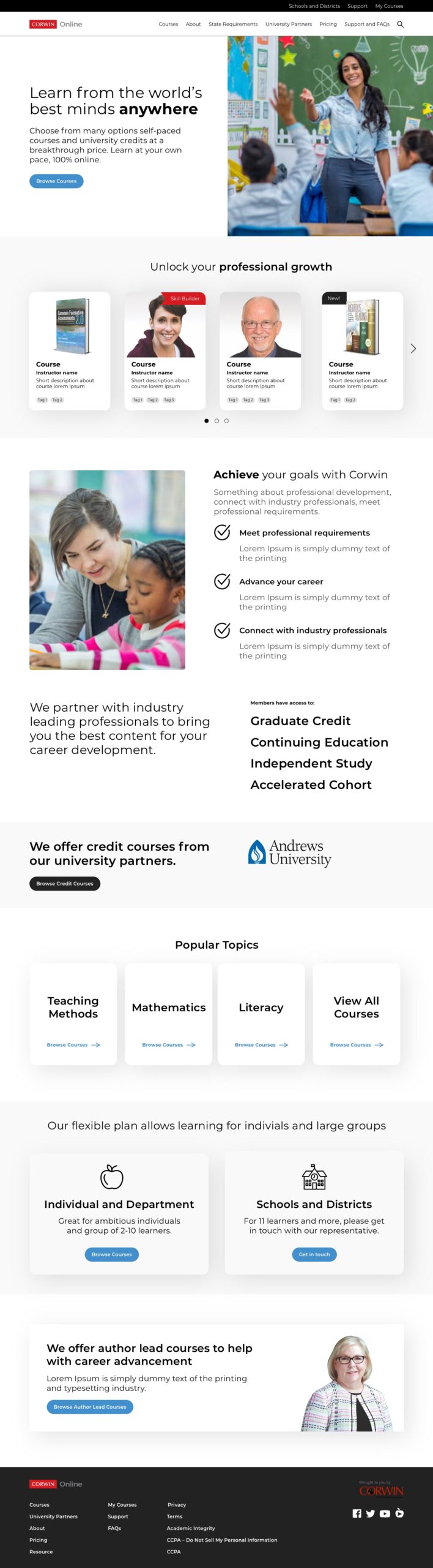
UI – Branding guidelines
Following guidelines of accessible design, three moodboards were presented to the client to select from. The colors were to represent positivity and empowerment. The typeface was in line with company’s branding guidelines.
Stage 5 – Next steps
We ended the scope of work after the content was provided to the developer to upload on Thought industries. Next steps for the client would be to have this live and running.
Reflection
I loved working on this project. Education is important and seeing companies wanting to make sure they can empower their users in the right way, is rewarding. We had tight timelines and getting all of this done in a month was amazing and I learned a lot. I also learned the difference in working styles when I’m working on a project solo versus collaborating with a team and managing expectations. Definitely a great experience.